Auto Protection Sales

  • Compam

  • Texans Credit Union

  • Role

  • UX Designer

  • Timeline

  • 4 Weeks

  • Scope

  • Web & Mobile

Turning a manual, advisor driven sales process into a guided experience members can complete on their own.

Reframing The Brief

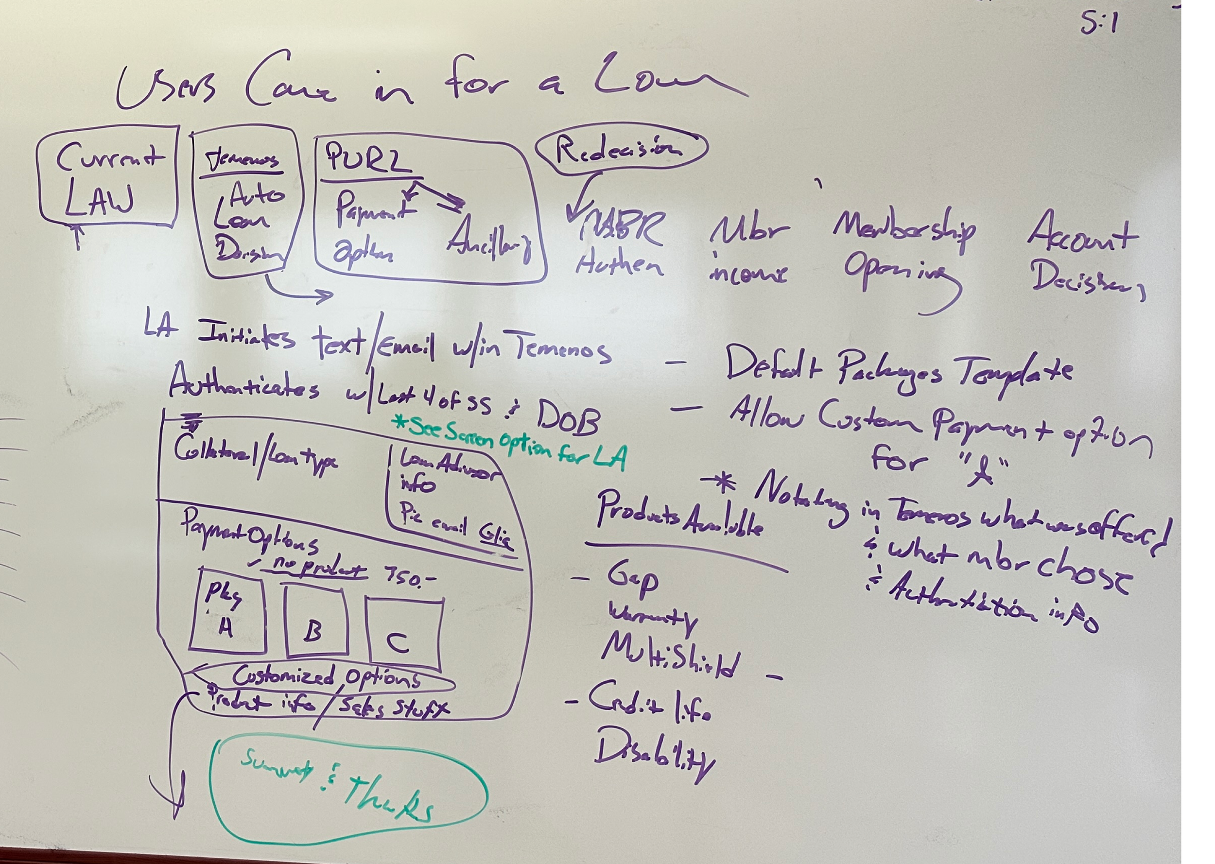
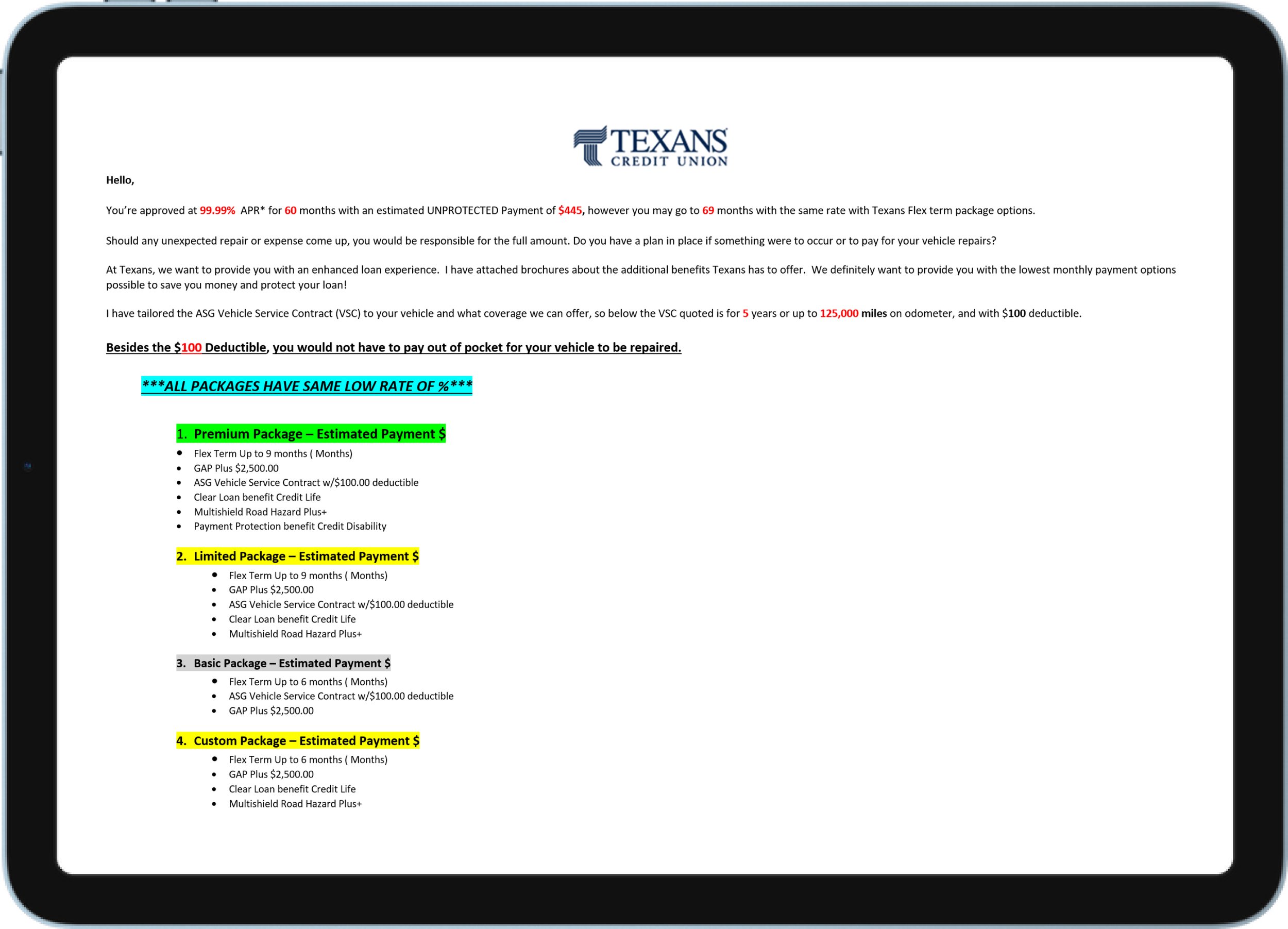
Vehicle protection is one of the highest margin products a credit union sells, but it was being offered at the weakest moment. After a loan was approved, advisors manually built a package list, calculated payments by hand, and emailed it over. Members were left to interpret an unfamiliar product days after the moment they cared about the car.

​

After mapping the workflow with Lending Operations, I reframed it: the offer was arriving after the decision moment, in a format that asked the member to do the math.

​

Timing. The offer landed once the emotional peak of buying had passed.

​

Cognitive load. Members got the full catalog and were asked to compare products they had never seen.

​

Manual pricing. Hand calculated figures were inconsistent and impossible to show live.
Person with a gray plastic bag over their head holding two halves of a grapefruit in front of their eyes, set against an orange background with a light blue border.

Brianstorming Workflow

What Research Changed

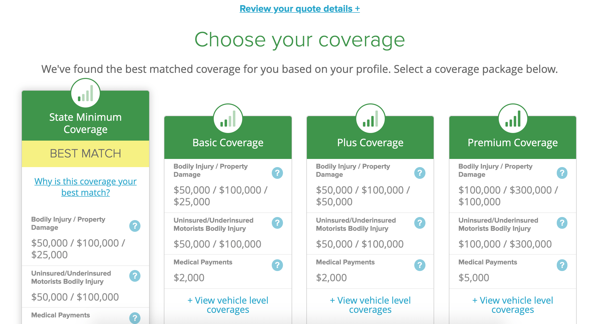
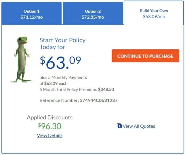
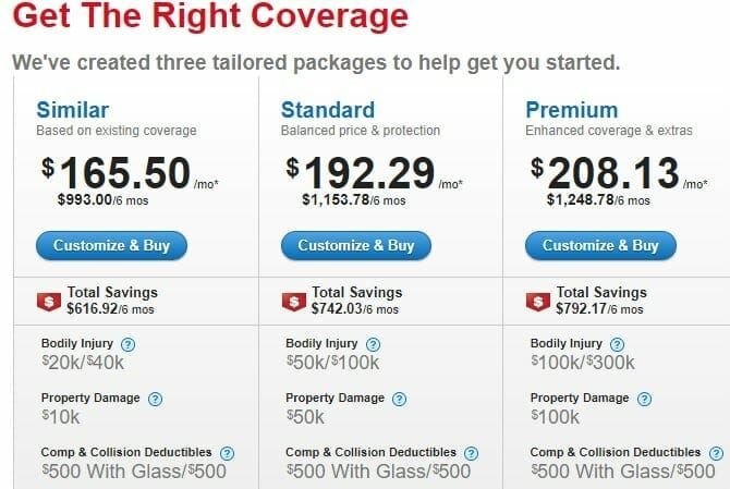
I audited how Allstate, State Farm, and Geico structure coverage selection, and traced an industry shift toward decoupling protection from the base loan.

​

Members want a total, not a menu.

They tried to reach an all in monthly figure and abandoned when the effort got too high.

​

Trust outweighed price.

A personalized, verified offer outperformed a cheaper one. Timing and legitimacy were the levers, not discounting.

​

​

Person with a gray plastic bag over their head holding two halves of a grapefruit in front of their eyes, set against an orange background with a light blue border.

Design Principles

Show the number, not the catalog. Answer "what does this cost me monthly" before asking anything.

​

Earn the click before asking for it. Establish legitimacy before presenting an offer.

​

One decision per screen. Sequence complexity, never stack it.

Decisions and Tradeoffs

Decisions and tradeoffs

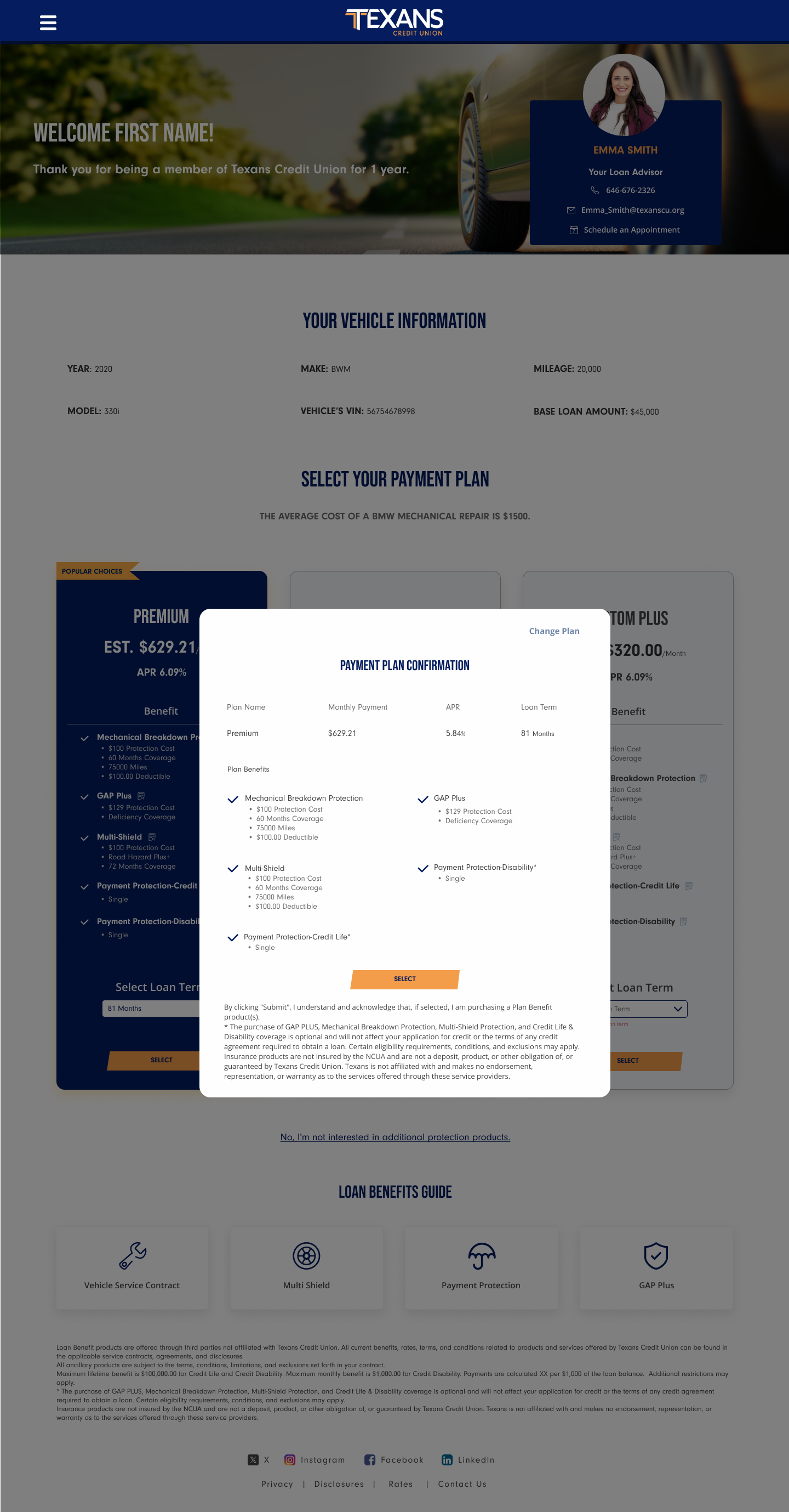
Verification before the offer. Members confirm identity before the advisor calls. Tradeoff: adds a step to a funnel we wanted shorter. I accepted it because an unverified financial offer reads as a scam, and that drop off is unrecoverable. Three iterations kept the step as light as possible.

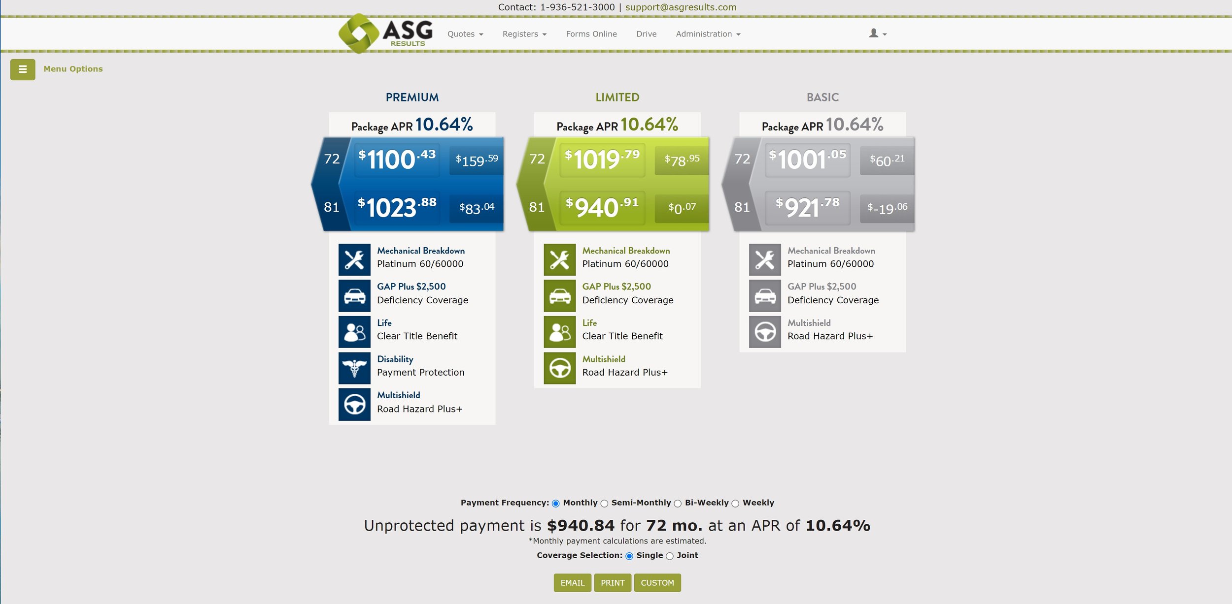
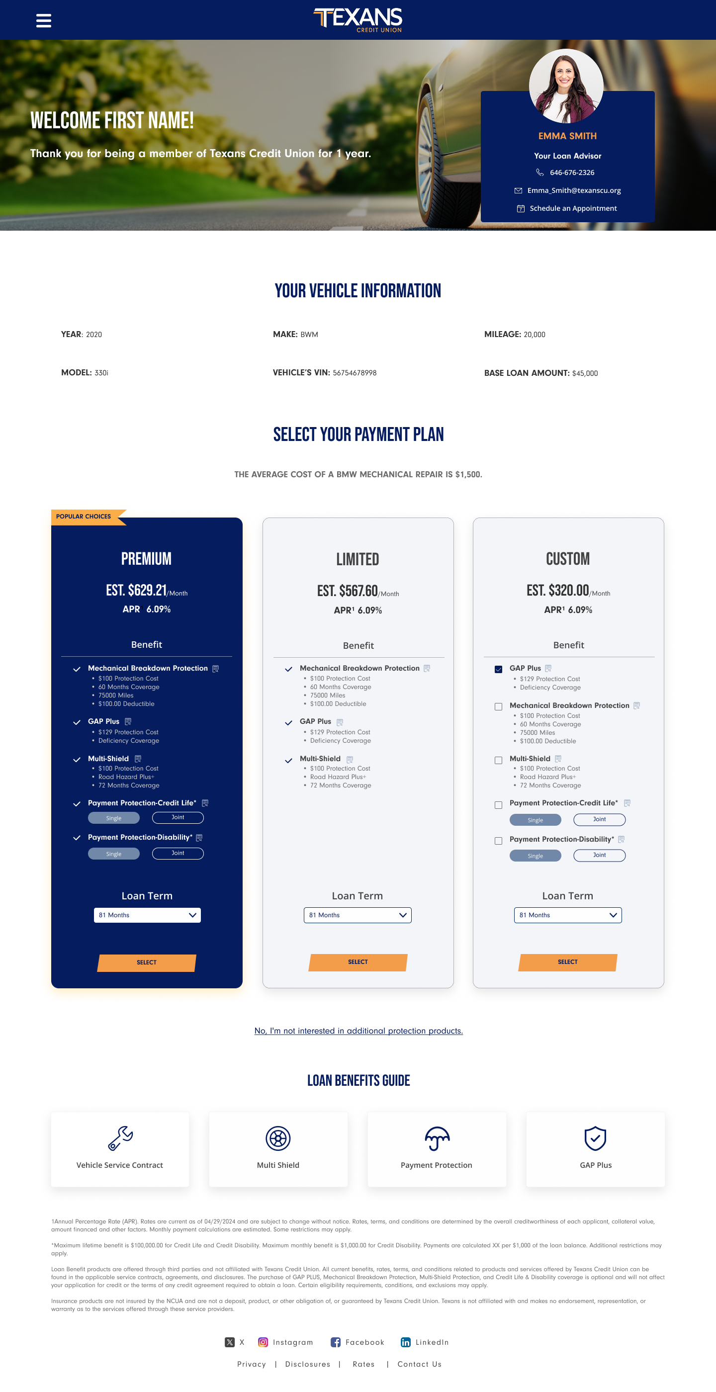
Personalized packages with live pricing. A tailored set replaces the full catalog, priced in real time as coverage changes. Tradeoff: narrowing risks suppressing valid choices. I kept the full set one interaction away rather than removing it, so the default is simple but nothing is hidden. This also moved calculation off the advisor entirely.

Guided decline recovery. Declining surfaces one confirmation with relevant claims history. Tradeoff: this sits close to a dark pattern. With Compliance, I set hard limits: it appears once, uses factual data instead of persuasive language, and never blocks the exit. The goal was correcting an uninformed decline, not pressuring an informed one.

Responsive parity. Members open these on a phone while advisors work on desktop, so I built a shared component structure instead of designing twice.

Person with a gray plastic bag over their head holding two halves of a grapefruit in front of their eyes, set against an orange background with a light blue border.

Outcome

Members get a transparent view of real cost, delivered when it is relevant. Advisors lose the calculation burden and gain a live tool that makes conversations faster. The business gains a reusable pattern that extends to other product lines.

Metrics defined for launch: package attach rate, time from approval to decision, advisor handling time, and verification drop off.

Responsive parity. Members open these on a phone while advisors work on desktop, so I built a shared component structure instead of designing twice.

Reflection

The most valuable work here was not a screen. It was reframing a formatting request into a timing and clarity problem, then aligning Lending and Compliance early enough to build it.

With more runway, I would validate the decline moment with real members. It is the highest leverage and highest risk interaction in the flow, and internal consensus is not evidence.

More works

© 2026

Home

Work

About

Auto Protection Sales

  • Compam

  • Texans Credit Union

  • Role

  • Lead UX Designer

  • Timeline

  • 4 Weeks

  • Scope

  • Web & Mobile

Turning a manual, advisor driven sales process into a guided experience members can complete on their own.

Reframing The Brief

Vehicle protection is one of the highest margin products a credit union sells, but it was being offered at the weakest moment. After a loan was approved, advisors manually built a package list, calculated payments by hand, and emailed it over. Members were left to interpret an unfamiliar product days after the moment they cared about the car.

​

After mapping the workflow with Lending Operations, I reframed it: the offer was arriving after the decision moment, in a format that asked the member to do the math.

​

Timing. The offer landed once the emotional peak of buying had passed.

​

Cognitive load. Members got the full catalog and were asked to compare products they had never seen.

​

Manual pricing. Hand calculated figures were inconsistent and impossible to show live.
Person with a gray plastic bag over their head holding two halves of a grapefruit in front of their eyes, set against an orange background with a light blue border.

Brainstorming Workflow

What Research Changed

I audited how Allstate, State Farm, and Geico structure coverage selection, and traced an industry shift toward decoupling protection from the base loan.

​

Members want a total, not a menu.

They tried to reach an all in monthly figure and abandoned when the effort got too high.

​

Trust outweighed price.

A personalized, verified offer outperformed a cheaper one. Timing and legitimacy were the levers, not discounting.
​

​

Person with a gray plastic bag over their head holding two halves of a grapefruit in front of their eyes, set against an orange background with a light blue border.

Design Principles

Show the number, not the catalog. Answer "what does this cost me monthly" before asking anything.

​

Earn the click before asking for it. Establish legitimacy before presenting an offer.

​

One decision per screen. Sequence complexity, never stack it.

Decisions and Tradeoffs

Decisions and tradeoffs

Verification before the offer. Members confirm identity before the advisor calls. Tradeoff: adds a step to a funnel we wanted shorter. I accepted it because an unverified financial offer reads as a scam, and that drop off is unrecoverable. Three iterations kept the step as light as possible.

Personalized packages with live pricing. A tailored set replaces the full catalog, priced in real time as coverage changes. Tradeoff: narrowing risks suppressing valid choices. I kept the full set one interaction away rather than removing it, so the default is simple but nothing is hidden. This also moved calculation off the advisor entirely.

Guided decline recovery. Declining surfaces one confirmation with relevant claims history. Tradeoff: this sits close to a dark pattern. With Compliance, I set hard limits: it appears once, uses factual data instead of persuasive language, and never blocks the exit. The goal was correcting an uninformed decline, not pressuring an informed one.

Responsive parity. Members open these on a phone while advisors work on desktop, so I built a shared component structure instead of designing twice.
Person with a gray plastic bag over their head holding two halves of a grapefruit in front of their eyes, set against an orange background with a light blue border.

Outcome

Members get a transparent view of real cost, delivered when it is relevant. Advisors lose the calculation burden and gain a live tool that makes conversations faster. The business gains a reusable pattern that extends to other product lines.

Metrics defined for launch: package attach rate, time from approval to decision, advisor handling time, and verification drop off.

Responsive parity. Members open these on a phone while advisors work on desktop, so I built a shared component structure instead of designing twice.

Reflection

The most valuable work here was not a screen. It was reframing a formatting request into a timing and clarity problem, then aligning Lending and Compliance early enough to build it.

With more runway, I would validate the decline moment with real members. It is the highest leverage and highest risk interaction in the flow, and internal consensus is not evidence.

More works