Compam
Texans Credit Union
Role
Lead UX Designer
Timeline
Phased
Scope
Web & Mobile
Turning the limits of a third party banking platform into one member owned space, delivered in phases.
Reframing The Brief
Texans Credit Union runs its digital banking on Alkami, a third party platform. That vendor relationship sets the ceiling: we can design custom features, but only what our own engineers can build on top of what Alkami allows. Autonomy is limited, engineering capacity is shared, and every new idea competes for the same narrow build window.
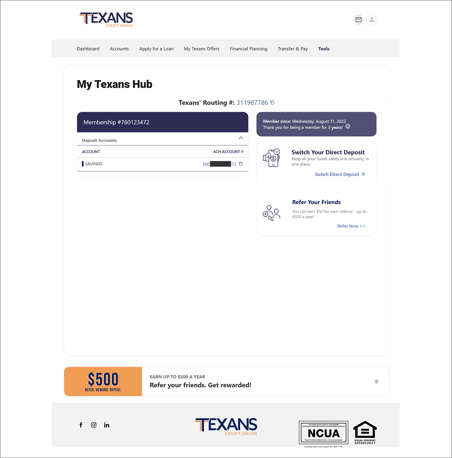
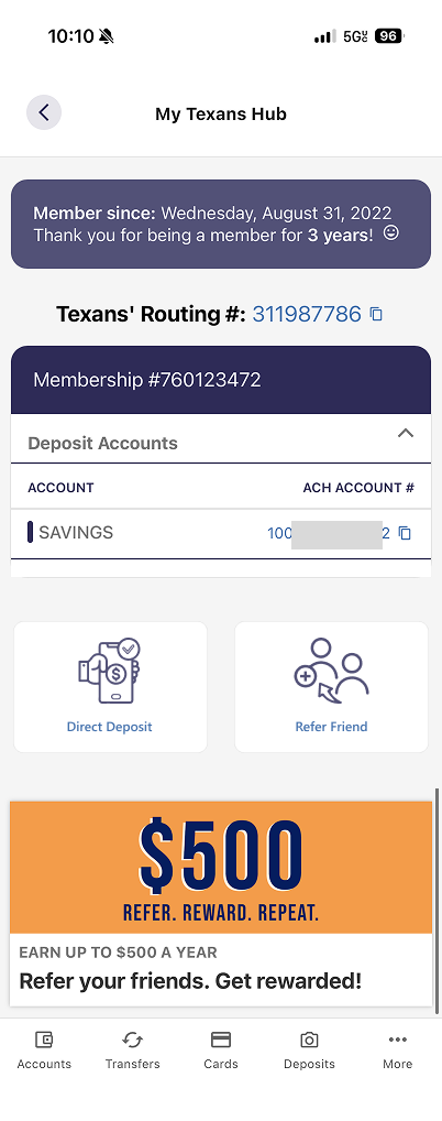
I led the design of My Texans Hub, a single page that consolidates the features we most wanted to own but could not scatter across a platform we do not fully control.
The obvious path was to lobby for individual features across the banking experience, a beneficiary tool here, a limits screen there. That path was slow, political, and fragile, because each request depended on vendor roadmap and isolated engineering approval.
I reframed the problem. Instead of fighting the platform for space in ten places, we would claim one. Consolidating our custom features into a single hub turned a limitation into leverage: one page we controlled, one consistent experience, and one predictable surface our engineers could build against phase by phase. The constraint stopped being a blocker and became the organizing principle.
Structuring the page
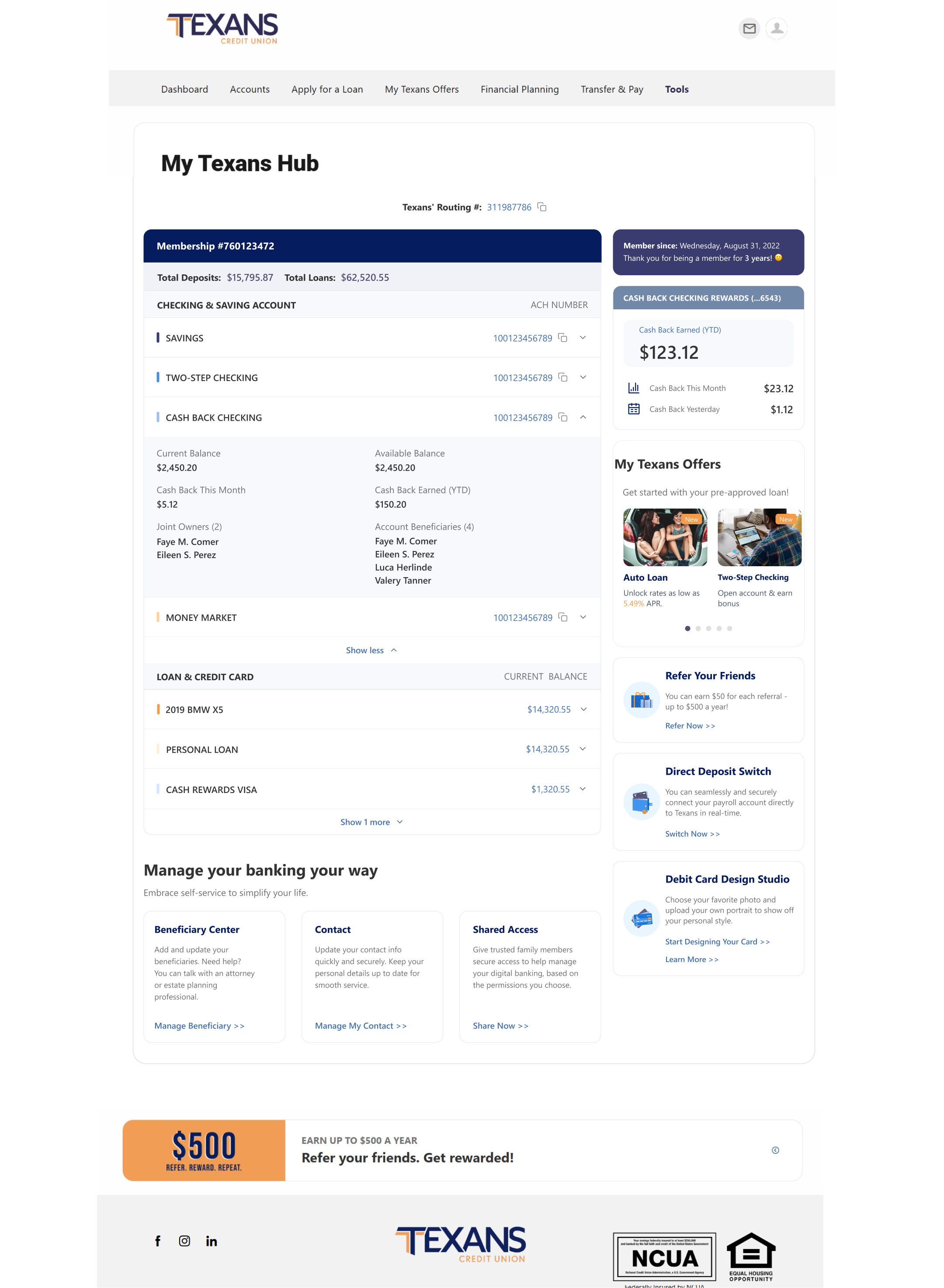
I organized the hub around three columns of member need, from most to least frequent.
Left, the account ledger. A clear table of the member's deposits, loans, and credit cards. Each row expands into a card so detail stays one tap away, never crowding the overview. Deposit accounts reveal ACH number, balances, joint owners, and beneficiaries. Loans and credit cards reveal interest rate, monthly payment, next payment date, payoff date, payment source, and autopay status, the answers members actually call in to ask.
Below, the self service zone. The actions members used to need a branch or a phone call for: adding a POD beneficiary, checking transfer limits, managing contact info and shared access. This is where the hub quietly reduces support load.
Right, the opportunity rail. Personalized, not promotional. Membership tenure, system detected pre approved offers, refer a friend, direct deposit switch, and the Debit Card Design Studio. Relevant prompts, kept out of the member's way until they want them.
Member since: Wednesday, August 31, 2022
Thank you for being a member for 3 years! 🙂
Cash Back Earned (YTD)
$123.12


Cash Back This Month
$23.12


Cash Back Yesterday
$1.12
Cash Back checking rewards (...6543)
My Texans Offers
Get started with your pre-approved loan!

New
Auto Loan
Unlock rates as low as 5.49% APR.

New
Two-Step Checking
Open account & earn bonus

Credit Card
Earn rewards on purchases

Home lending
Borrow money for home.

Refer Your Friends
You can earn $50 for each referral - up to $500 a year!
Refer Now >>

Direct Deposit Switch
You can seamlessly and securely connect your payroll account directly to Texans in real-time.
Switch Now >>
Membership #760123472
Total Deposits:
$15,795.87
Total Loans:
$62,520.55
ACH Number
Checking & Saving Account
Cash Back Checking
100123456789


Current Balance
$2,450.20
Available Balance
$2,450.20
Cash Back This Month
$5.12
Cash Back Earned (YTD)
$150.20
Joint Owners (2)
Faye M. Comer
Eileen S. Perez
Account Beneficiaries (4)
Faye M. Comer
Eileen S. Perez
Luca Herlinde
Valery Tanner
My Texans Offers
Get started with your pre-approved loan!
New
Auto Loan
Unlock rates as low as 5.49% APR.
New
Two-Step Checking
Open account & earn bonus
Credit Card
Earn rewards on purchases
Home lending
Borrow money for home.
Manage your banking your way
Embrace self-service to simplify your life.
Beneficiary Center
Add and update your beneficiaries. Need help? You can talk with an attorney or estate planning professional.
Manage Beneficiary >>
Contact
Update your contact info quickly and securely. Keep your personal details up to date for smooth service.
Manage My Contact >>
Shared Access
Give trusted family members secure access to help manage your digital banking, based on the permissions you choose.
Share Now >>
Key decisions
Progressive disclosure over density.
Banking data is dense, and members are anxious about it. Every account collapses to a single line and expands only on intent, so the page answers "what do I have" at a glance and "tell me everything" on demand. One decision per row, never a wall of numbers.
Answer the call before it happens.
I prioritized the expanded fields around the questions our support team fields most: when is my payment due, what's my payoff date, is autopay on. Surfacing those turned a phone call into a glance, and it became the clearest business case for the whole page, cutting related support calls by 30%.
Personalization over promotion.
The right rail could easily have become an ad column. I anchored it in the member first, tenure and a thank you, then earned attention with genuinely useful, pre qualified offers. The Design Studio sits here as delight, not upsell.
Designing for phased delivery
Because engineering capacity was limited, the hub was never going to ship at once. I designed it as a modular system so it could launch in phases without ever looking half built.
Each account card, each self service tile, and each rail module was designed as an independent, self contained unit. That let us sequence delivery by engineering readiness and business priority, shipping the account ledger first and layering in self service and personalization over time, while every release still felt complete. Designing for phasing was not a compromise. It was the plan.
Outcome
My Texans Hub gave Texans a space it owns inside a platform it does not.
Impact: a 30% reduction in related support calls, as members now self serve answers they used to phone in for, and 30% of POD beneficiary additions shifted to self service, removing a task that previously required staff assistance.
For members: the answers they used to call for, now one page and one tap away.
For the credit union: a consolidated, extensible surface for custom features, reducing dependence on vendor roadmap and lowering support volume.
For the roadmap: a modular foundation that keeps absorbing new features phase by phase, without a redesign each time.

Reflection
The most valuable move on this project was not a screen. It was reframing a platform limitation into a product strategy, deciding to consolidate rather than fight for scattered space.
As delivery continues, my focus is holding the line on that founding principle: every new feature earns its place in the hub, and the page stays a calm, member first overview rather than a drawer everyone dumps things into. A hub is only as strong as the discipline that keeps it coherent.
More works
