Compam
Parler
Role
UX Designer
Timeline
4 Weeks
Scope
Web & Mobile
The third full rebuild of a scaling social platform, unifying brand, design system, and product into one coherent experience.
Reframing The Brief
Parler had already been rebuilt twice, and it was still fighting the same problem. The platform was scaling faster than its design could keep up.
I partnered with the design lead to lead that rebuild end to end, from brand foundation through the redesigned web and app experience.
I reframed v3 from "redesign the pages again" to "build the system the platform is generated from." That reframe is what made this version different from the two before it. The deliverable was no longer a set of screens. It was a durable foundation, brand plus system plus product, designed so the next hundred screens would stay consistent without anyone policing them.
Finding the brand from within
Before touching UI, I needed to know what Parler actually was, not what it looked like.
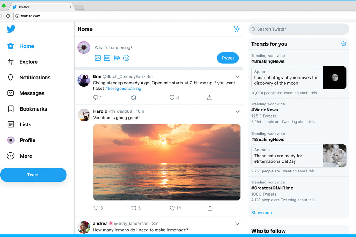
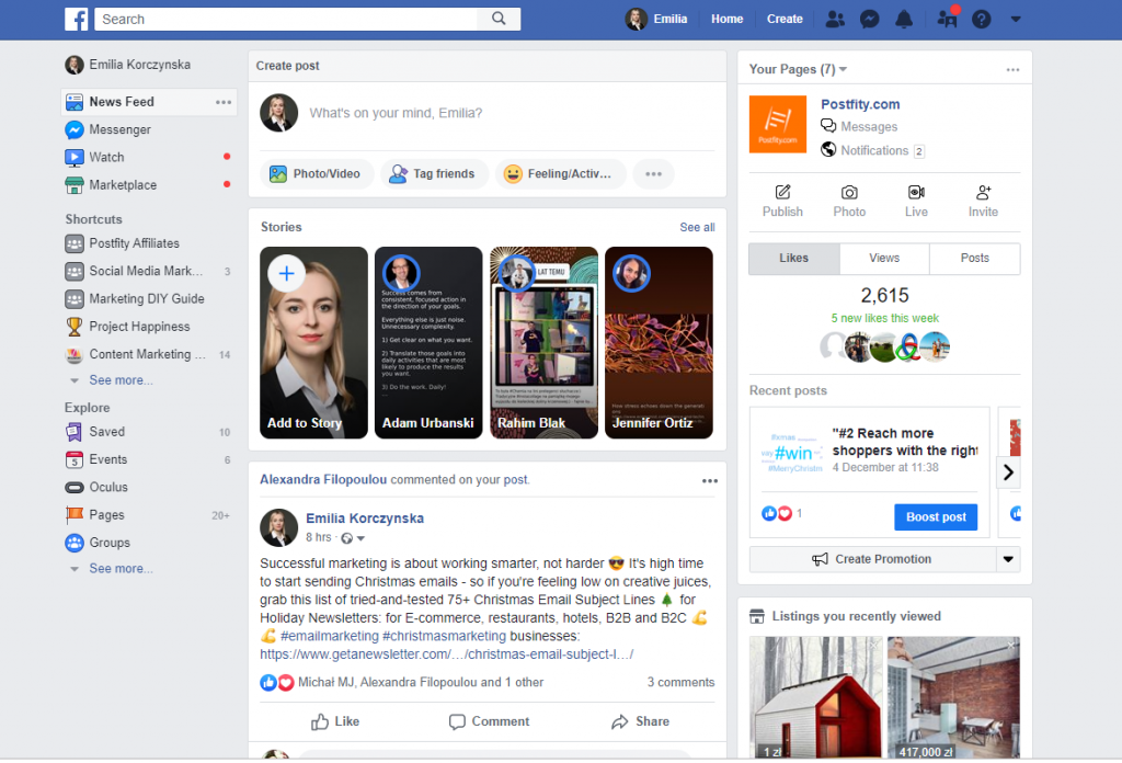
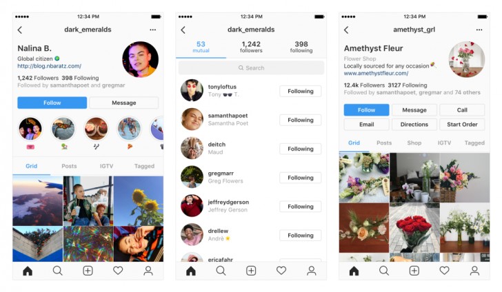
I benchmarked Twitter, Facebook, and Instagram on the fundamentals to set the baseline. Then, instead of imposing a brand from the outside, I surveyed the organization, asking each stakeholder for the two or three words that best described Parler. This surfaced the brand from within and gave every leader a stake in v3, turning later reviews from debates into confirmations.
I synthesized the responses into four dimensions that became the backbone of the visual language:
- Value: nimbleness, integrity, depth, empowerment
- Personality: curious, knowledgeable, methodical, empathetic
- Tone: enthusiastic, calm, inspiring, friendly
- Presentation: timeless, clean, concise, futuristic
What I built, and how I drove adoption
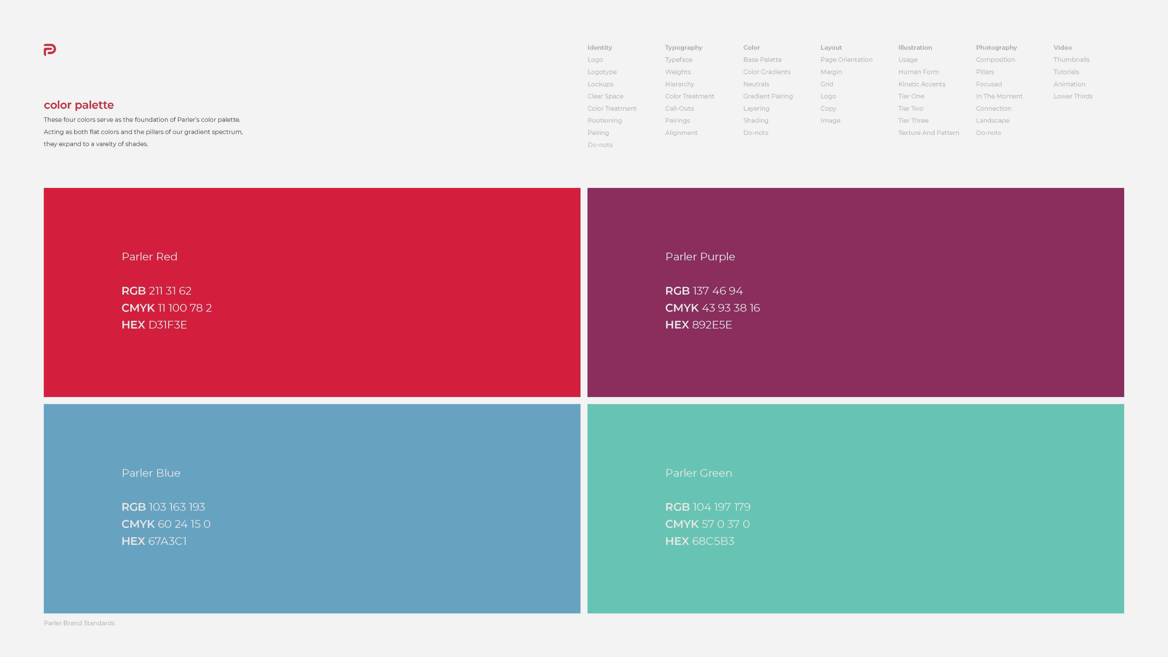
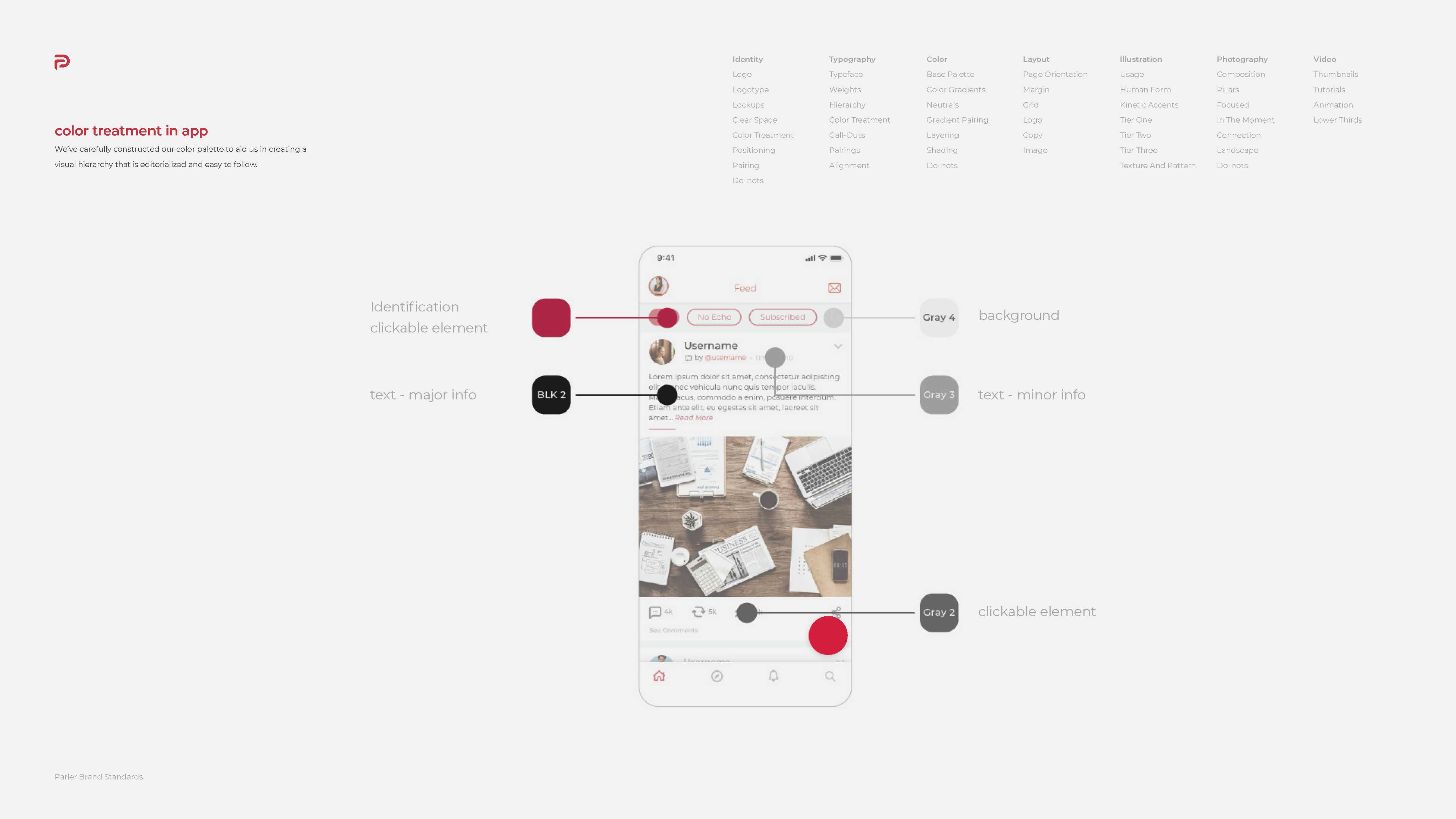
Brand and foundations. I set the base guidelines with the design lead, brand, type, and color first, so every downstream decision inherited a consistent root.
A new icon set. Built from scratch to a shared grid and stroke standard, so the icons read as one family, not a collection.
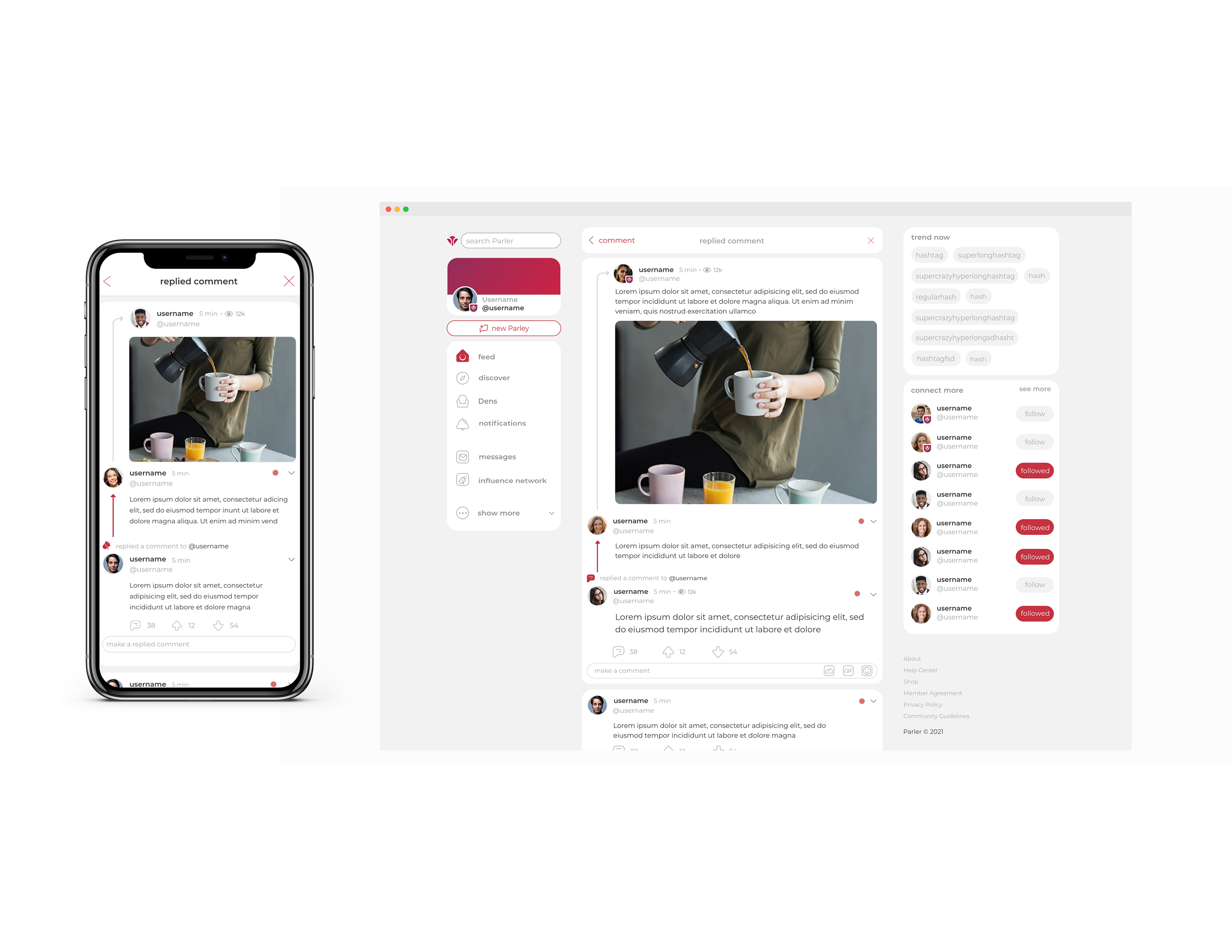
A component library. Reusable, responsive components for web and app that let the team assemble screens instead of redrawing them.
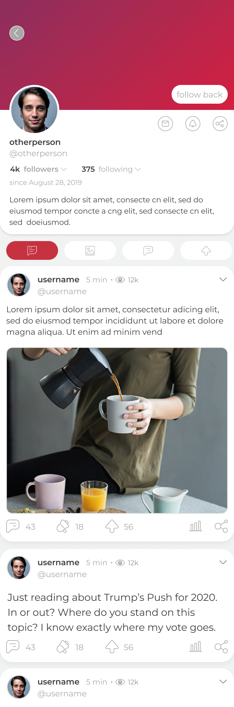
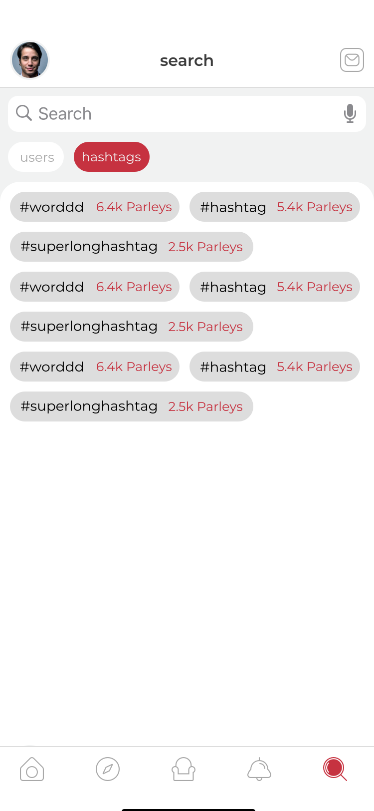
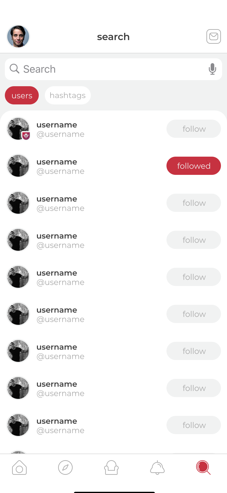
A rebuilt platform. On that foundation, web and app were redesigned on top of the system, not around it, delivering v3 in four months.
But artifacts were the easy part. A platform only stays consistent if the team actually builds from the system, so I designed the rollout as carefully as the components: I built with the team instead of handing over a finished set, and I made the system easier to follow than to ignore. That is what kept v3 from decaying the way v1 and v2 had.
Key Tradeoffs
System before screens. Foundations first meant slower visible progress and little to show early, a real risk on a team used to seeing pages move. I held the line because polished screens on no system would have recreated the exact failure of the last two versions. To manage it, I shared the growing library in progress, so stakeholders felt momentum before the pages caught up.
Brand from the inside out. Surveying the org took longer than designing a brand and presenting it. I chose the slower path on purpose, because a brand the team helped define is a brand the team defends, and that alignment compounded across every review that followed.



















Outcome
In four months, v3 turned a repeatedly patched platform into one coherent, system driven experience.
Impact: a 30% increase in new user retention within the first week, as a more consistent, trustworthy experience helped new users find their footing faster.
Product: a cohesive language across web and app, finally ending the page by page inconsistency that survived v1 and v2.
Team: a library and icon set that turned screen building from redrawing into assembling, cutting duplicated effort and speeding delivery.
Brand: an identity grounded in the organization's own words, not an outside guess, which made it authentic and easy to rally around.
Reflection
The most durable thing I built in v3 was not a screen. It was the system the platform is generated from, and the buy in that made the team own it. That is why this version held where the last two drifted.
Given more runway, I would invest next in documentation and governance, the rules for how the system evolves as new contributors join. A platform is only as consistent as the discipline that maintains it, and that is as much a people problem as a design one.
More works
