REDESIGN PARLER.
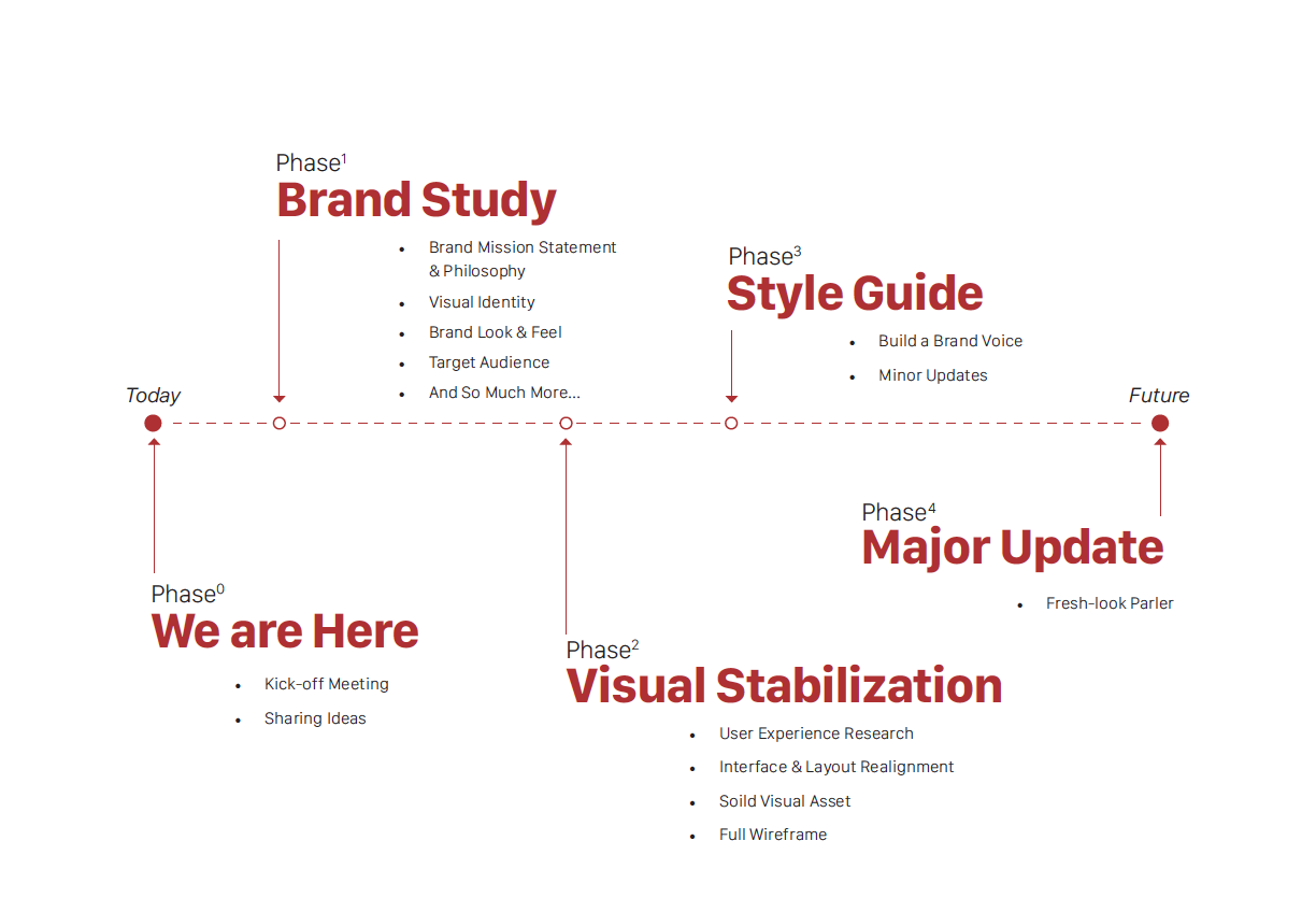
During my time at Parler, our team was tasked with redesigning web pages for the Parler App and website experience. Our redesign improves the user experience to better adhere to our branding and ensure. We’re in the process of achieving a better social media platform through various improvements to the UX design, visual design, interaction design, suggested code updates.
For more information please reach out to me via email or visit parler.com.
We wonder...
What is Parler?
Unique Selling Points Who’s Our Target Audience?The Goal of the Company Direct / Indirect Competitors Mr & Mrs. Parler
Good design is not only beautiful but also functional.
Meanwhile...
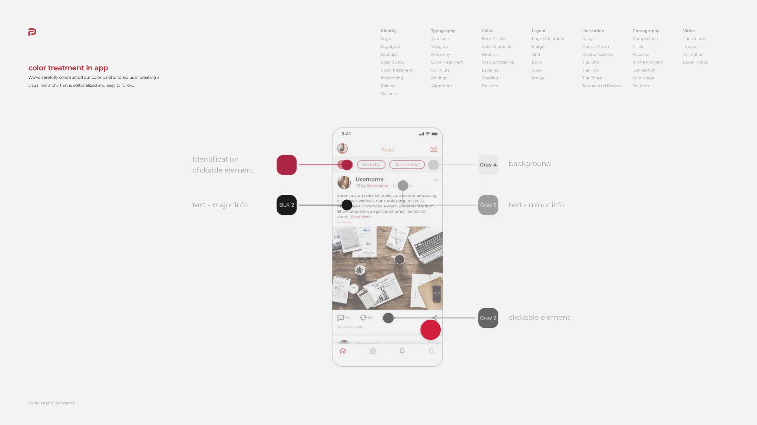
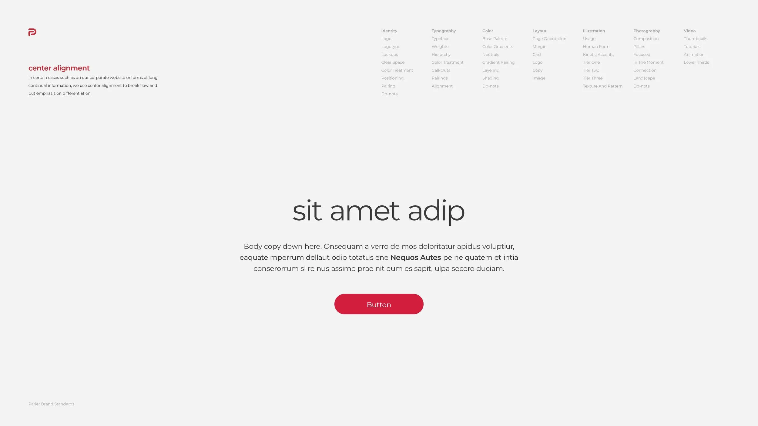
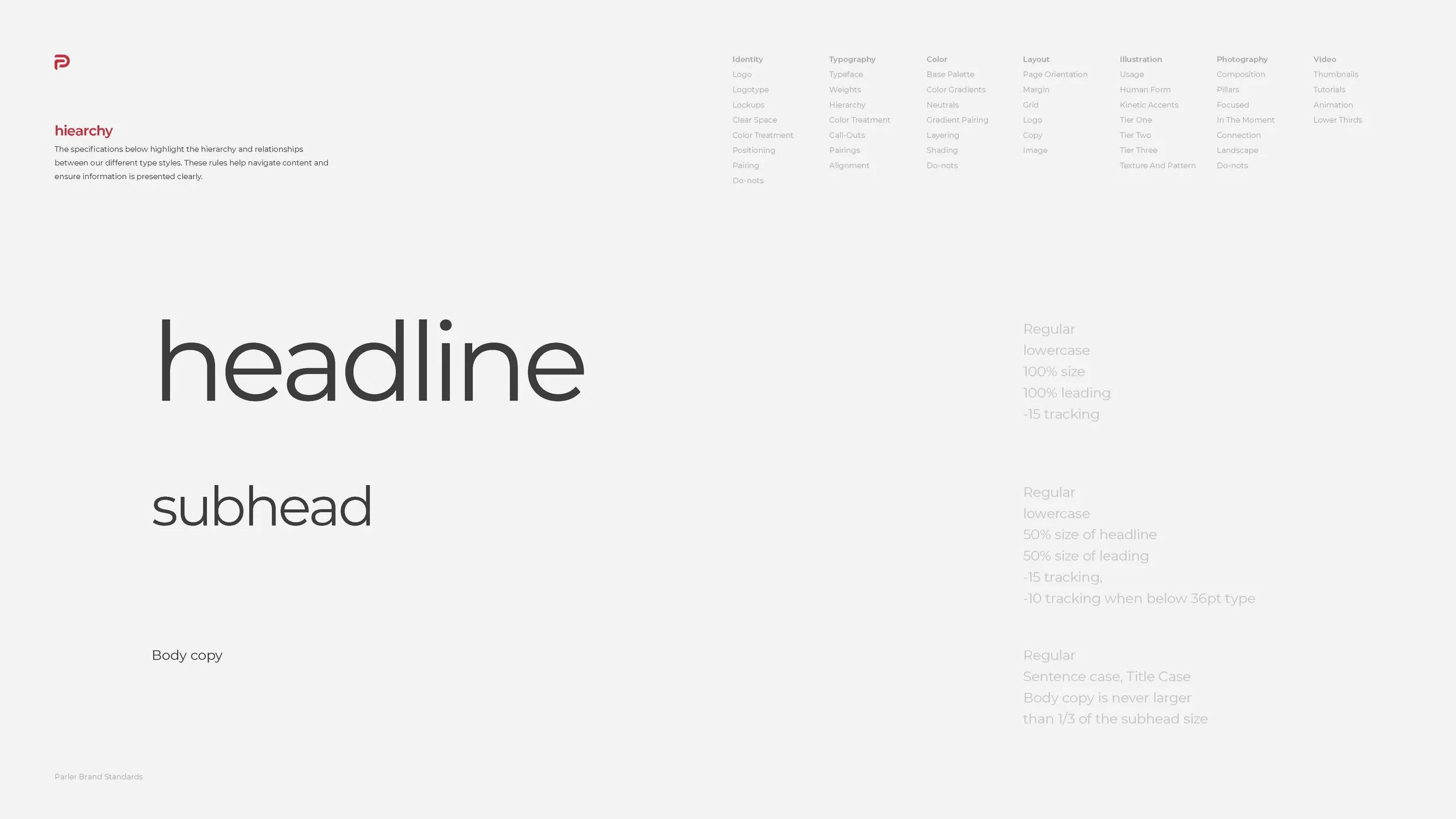
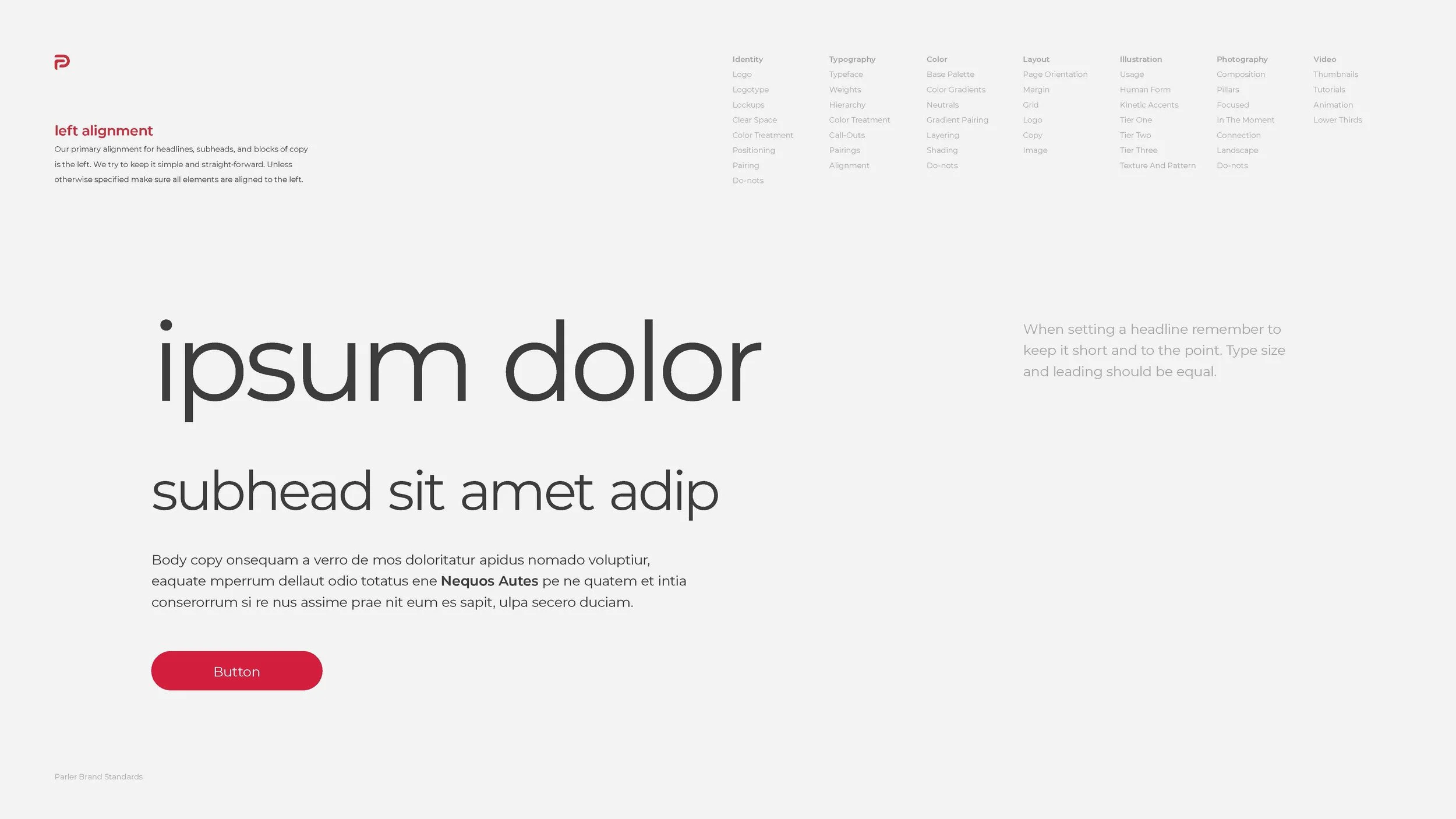
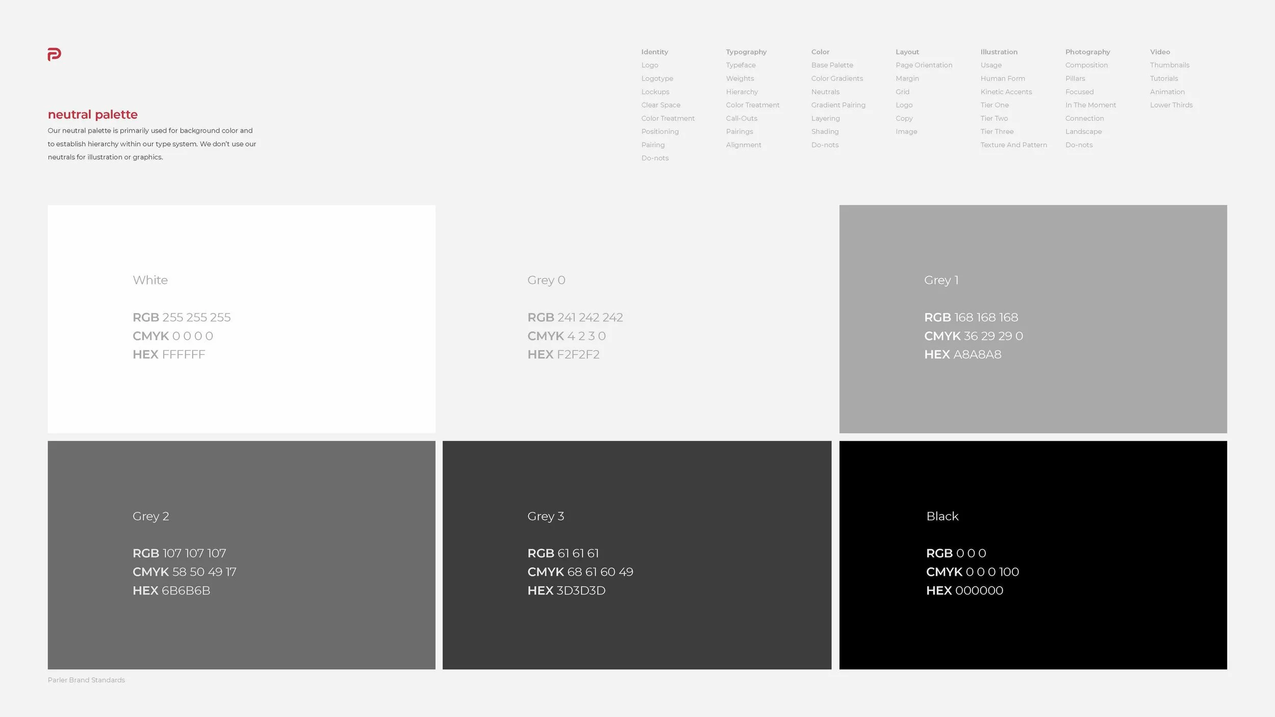
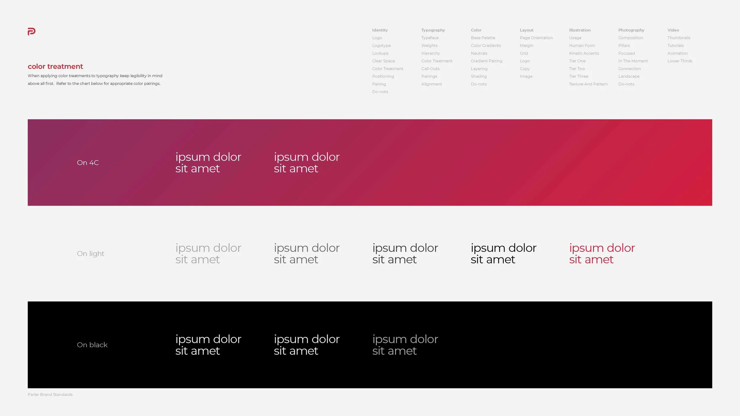
I help the designer leader work on basic guidelines and rules such as font usage & color scheme. I also start to develop a new icon set, component library and redesign the platform from scratch in 4 months. Redesigning products and features for web and app.
RESEARCH AND ANALYSIS
We begin our process at the research and analysis stage. Here, I've done the competitive analysis, user research, which we'll use to inform my design process.
REASSESSING OUR BRAND VALUES
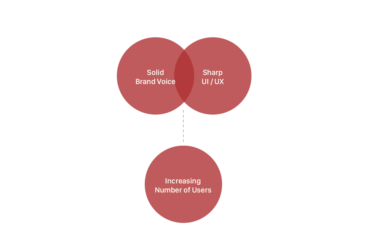
We wanted to create a brand that reflected our organization’s values. We made sure that every stakeholder in the firm as reflected in this process. We conducted a survey in the firm where we asked employees to write down two to three words that they think best describe Parler. This exercise later became the foundation of the visual design process.
COMPETITIVE ANALYSIS
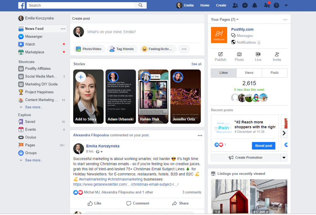
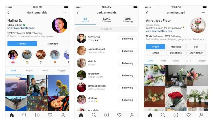
Our competitive analysis revealed numerous opportunities for Parler to improve the App design to meet the market trends' expectations and opportunities for App to showcase its unique capabilities. Our design team specifically looked at several firms that Parler has been competing for clients with recently. These competitors are Twitter, Facebook, and Instagram. When conducting a competitive analysis of their UX/UI, some of the features stood out.
A cohesive design language that permeated every page on App and website.
An elegant navigation solution that was responsive to accommodate devices of various sizes.
Take an image and video functionality offered insight into their user.
Organized layout interface.
BENCHMARKING
IDEATION&DESIGN
Visual Design
From the reassessing brand value survey, we categorized the word collection into four groups: value, personality, tone, and presentation.
Values
NimblenessIntegrityDeepEmpowermentPersonality
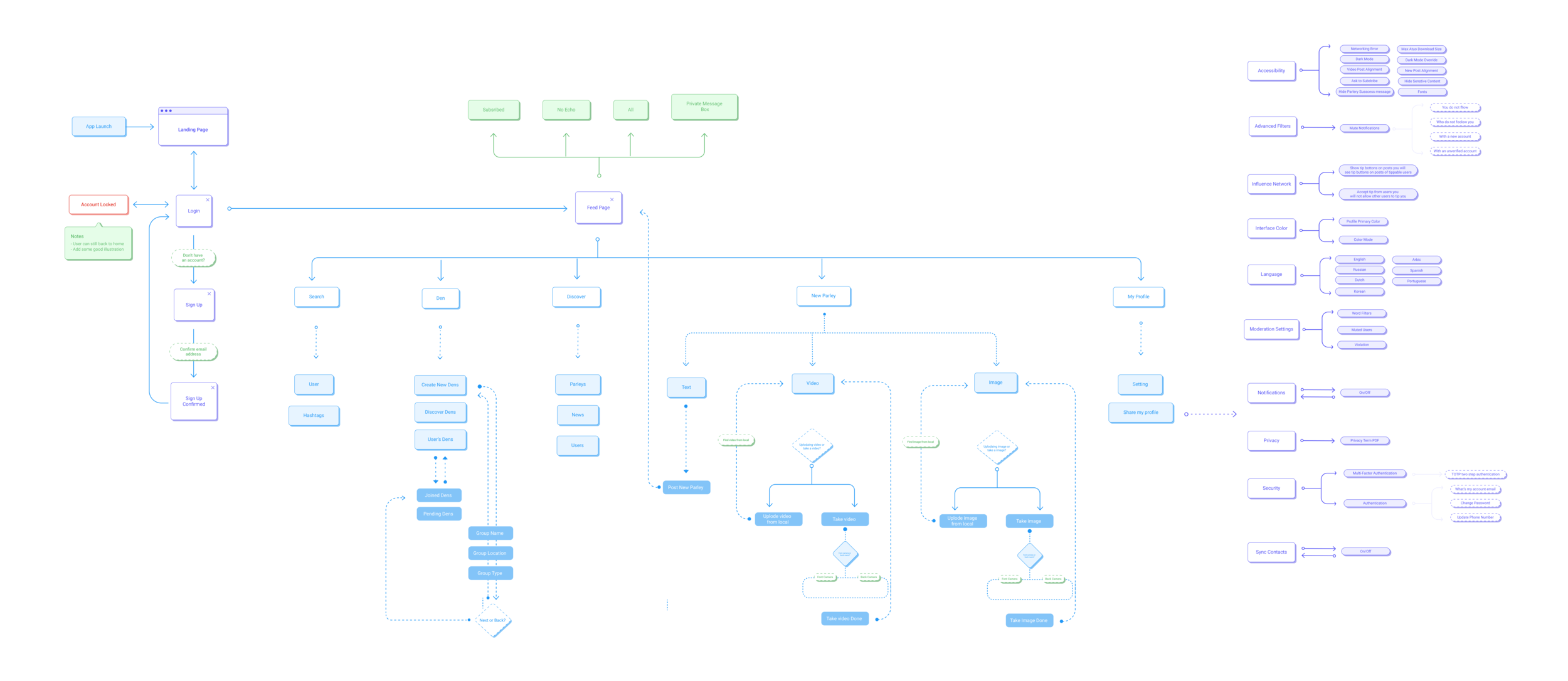
CuriousKnowledgeableMethodicalEmpatheticUSER FLOW
Tone
EnthusiasticCalmInspiringFriendlyINTERFACE DESIGN
FEED PAGE
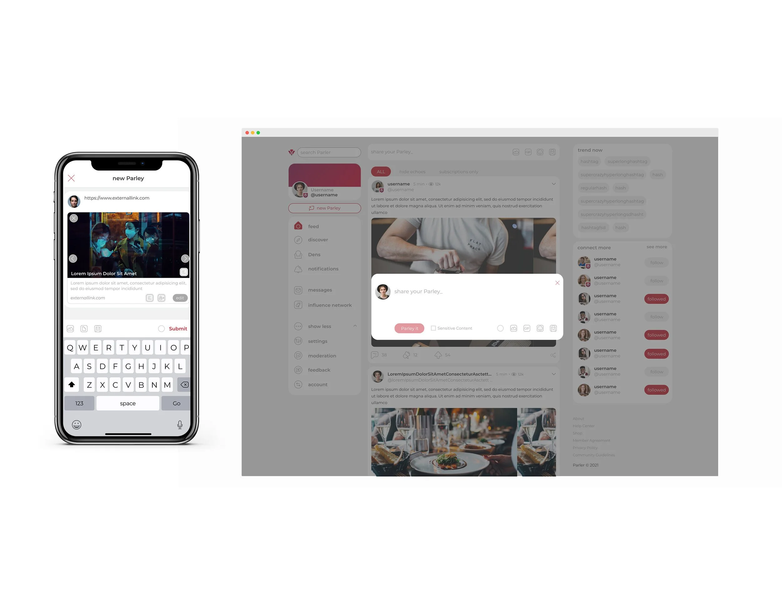
NEW PARLEY
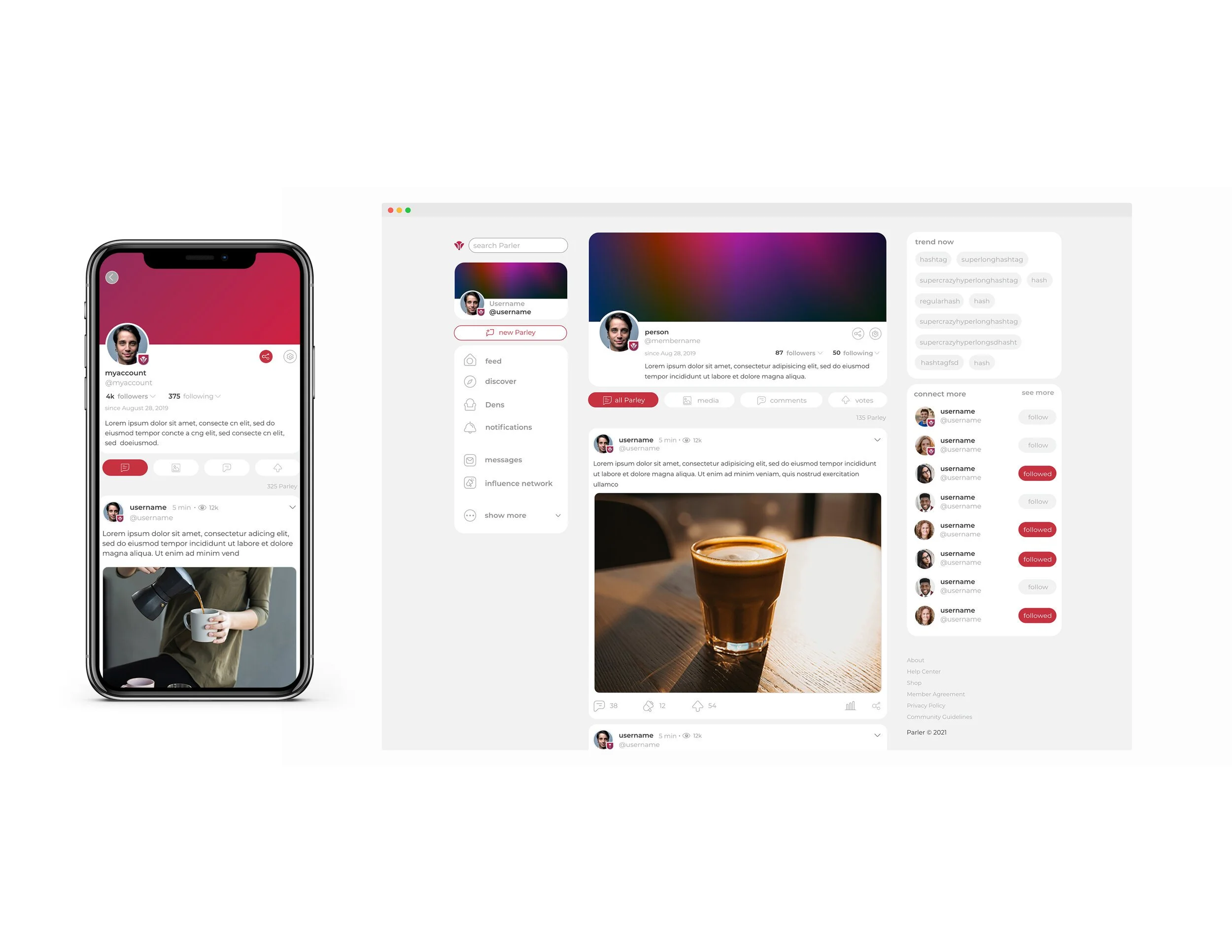
MY PROFILE
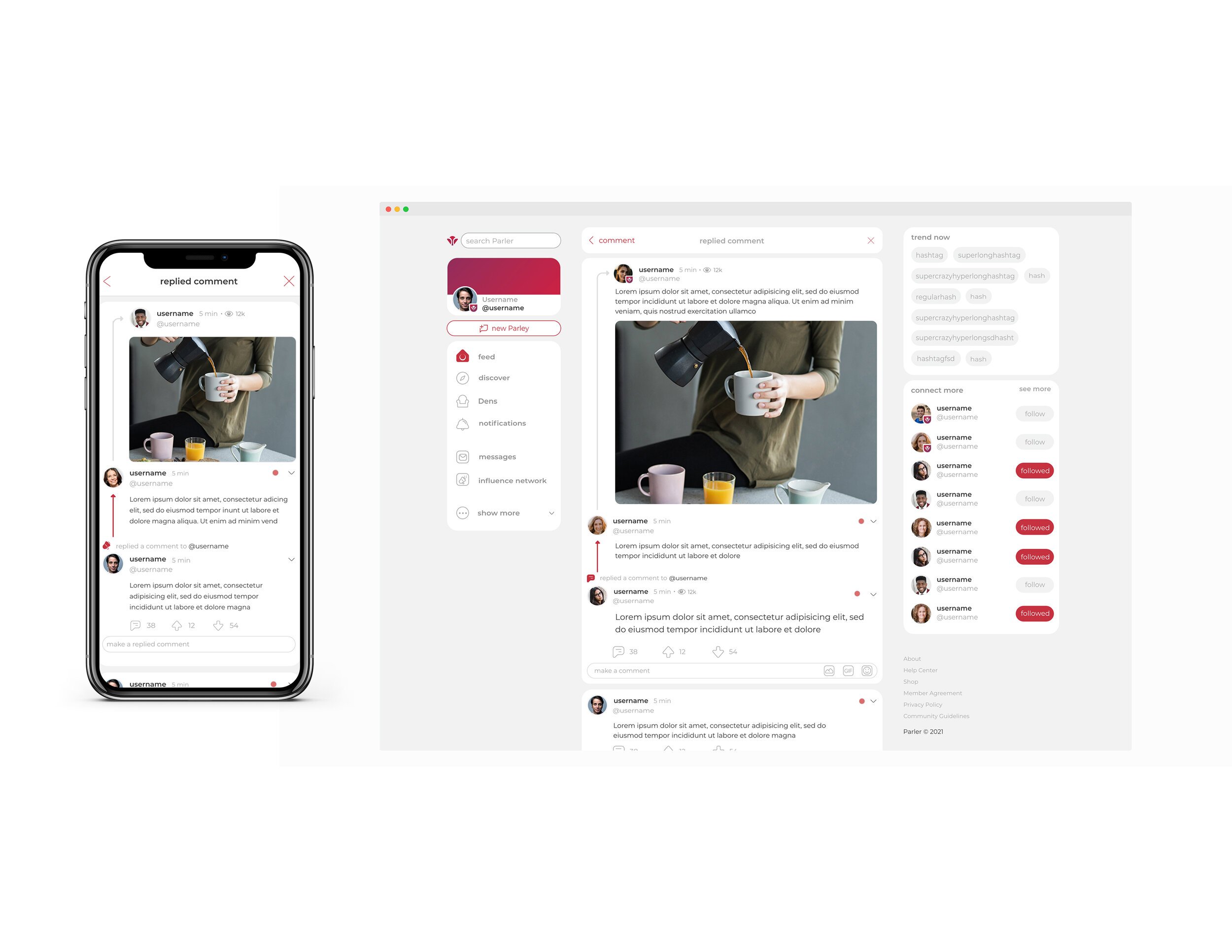
REPLIED COMMENT DETAILS
SEARCH BAR ACTIVE
Typography
Presentation
TimelessCleanConciseFuturistic